Templates provide the formatting and display information for a menu in DIRX2. For each Menu Experience in DIRX2, a template will be assigned to determine the look of the menu.
Template maintenance in DIRX2 offers a variety of configuration aspects for the various components. Depending on your goals, there may be some features that are not necessary for a given application.
Screen Layout
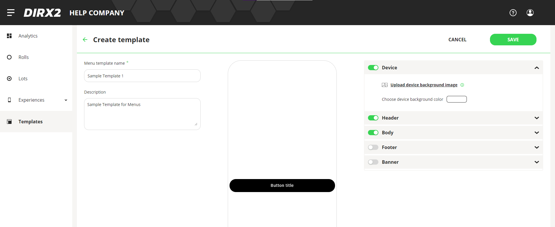
Within the Edit Template pane, there is a description for the Template to identify it, a Preview Pane, and several stacked Component Configuration Panes that are on the right side of the page.
Any changes made to the Component Configuration Panes(CCP) will be reflected immediately in the Preview Pane so you can make changes and see if you get the results that you are looking for.
Components of a Template
A Template is made up of 5 components: device, header, body, footer and a banner. There will be configuration components that are available within each of those sections that will allow you to get the look that you desire. In some cases, it might be best to try a configuration and view it in the preview pane to get the look you want.
Each component is configurable from the stacked Component Configuration Panes(CCP) at the right side of the screen. You can activate, deactivate and edit any of the components within the pane.
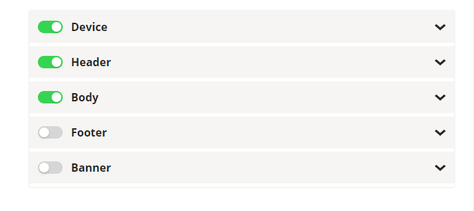
The On/Off toggle next to the name of the component turns any configuration within the pane on or off. When slid to the right and the toggle turns green, then any configuration within that panel is on, or active.
At the right side of the header bar is an arrow that opens the panel for editing. When the arrow points up, the panel is open for editing, when you click the arrow and it points down, the content of the pane is hidden.
The functionality on the header bar of the panels is the same for all of the panels within the templates screen.
Device Component Configuration Pane(CCP)
The Device CCP allows you to choose a background image or color for the entire mobile device when interacting with the experience. For example, you could define a background image with clear buttons over.

To upload an image, click Upload device background image, and you can upload an image from your local machine or network.
You can also click on the colored button in the section to select a color for the background of the experience with the Color Picker. This would be the background color for the entire device.
Image Info
Images are adjusted to fit the device accessing the experience, so we recommend SVG or PNG images of at least 250 pixels for best performance. JPG images can be used, but could be distorted with resizing.
Header Component Configuration Pane
–
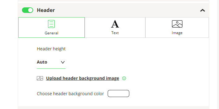
The Header CCP defines what happens within the top section of of your Menu Experience. Within this pane, you can define header size and components.
Within the Header CCP, there are three tabs to maintain different components of the header: General, Text, and Image.
General Tab for Header
Under the General Tab, you define the size and background for your header.
The Header height dropdown lets you select the size of the header: Auto, 20% or 40%.
With Auto, the size of the header is determined by the contents, so if you have a lot of text, the header might be large, even larger than the entire device meaning you would have to scroll to get to the buttons.
20% and 40% define the percentage of the screen that the header will take up. This will change based on the size of the device accessing the Menu. The choices here would be based on the look and feel desired by the user. If you are placing a logo image in the header, a 40% size might make it look better depending on the size of the logo.
The Header background image would be strictly for the header portion of the Menu and would be used OVER any device background image. The background image is for general look and feel for the menu, while if you were adding a logo, you would probably add that as an Image in the header and not the background.
To upload an image, click Upload header background image, and you can upload an image from your local machine or network.
You can also click on the colored button in the section to select a color for the background of the header in the experience with the Color Picker. This would be the background color for the entire header.
Text Tab for Header
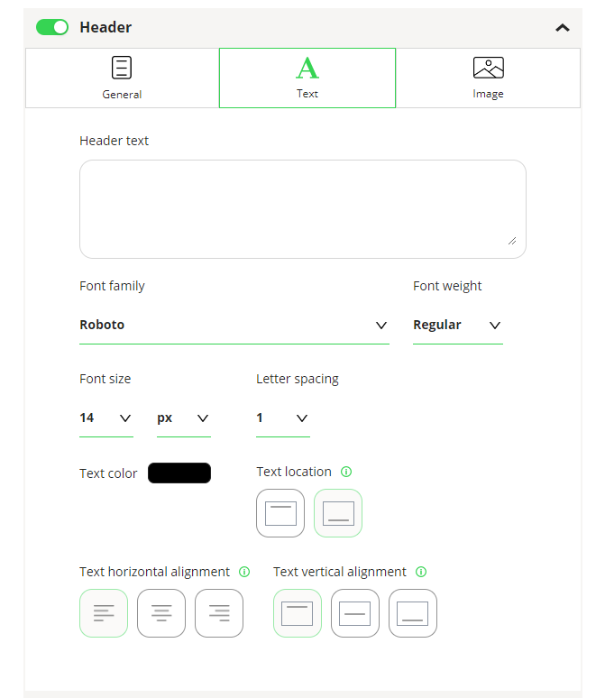
In the text tab, you can enter the text that will appear in the header as well as specify the look and placement of the text in the header.
In the Header text box, you can add any text for the header. You can add as much text as you want understanding that it can have an effect on the look of the menu and where the buttons appear.
For the Header text, you can select a Font family, Font weight, Font Size and Letter spacing. For more description of the Font definition functions, see this article “Using Font Definition Functions.”
To select a color for your text, click on the colored button in the section to select with the Color Picker.
Text location – defines whether any header text would appear above or below any image that appears in the Header. If you were planning to have a logo in the header with some text below, you would select the button with the bar at the bottom of the square for under the text.
Text horizontal alignment – Defines whether header text would be left justified, centered or right justified.
Text vertical alignment – Defines where the text will appear in the header: top, middle or bottom. Vertical alignment would define where the text would appear if there were no image. If an image is present in the header, vertical alignment for the text will be deactivated.
Image Tab for Header
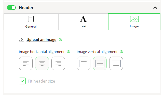
With the Image tab, you can add an image that will be added OVER the header background. This would be the most logical place for a logo.
To upload an image, click Upload an image, and you can upload an image from your local machine or network.
Image Info
Images are adjusted to fit the device accessing the experience, so we recommend SVG or PNG images of at least 250 pixels for best performance. JPG images can be used, but could be distorted with resizing.
Image horizontal alignment – Defines whether the image would be left justified, centered or right justified.
Image vertical alignment – Defines where the text will appear in the header: top, middle or bottom.
Fit Header Size Checkbox
The checkbox at the bottom of the image panel indicates whether you want your image to be sizes automatically to fit the header. This allows a user to upload a larger image and have the system resize it to fit.
Although this provides some ease of use in the system, it works the best with .svg and .png images. Resizing with other file types may not offer great results.
An alternative to click to have the image sized automatically is to add an image that is the appropriate size for a mobile device.
Body Component Configuration Pane
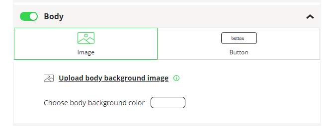
The Body CCP defines what happens within the body section of of your Menu Experience. The body will be defined by the area necessary to display the buttons for your menu. Your choices in this section will be affected by the number of menu items you intend to have in your menu.
Within the Body CCP, there are three tabs to maintain different components of the header: Image and Button.
Image Tab for Body
To upload an image, click Upload body background image, and you can upload an image from your local machine or network.
Click on the colored button in the section to select a color for the background of the Body section with the Color Picker. This would be the background color for the body section that appears behind any buttons.
Button Tab for Body
Within the Button tab, the look and presentation of the buttons is defined. The button content is defined in a Menu Experience.
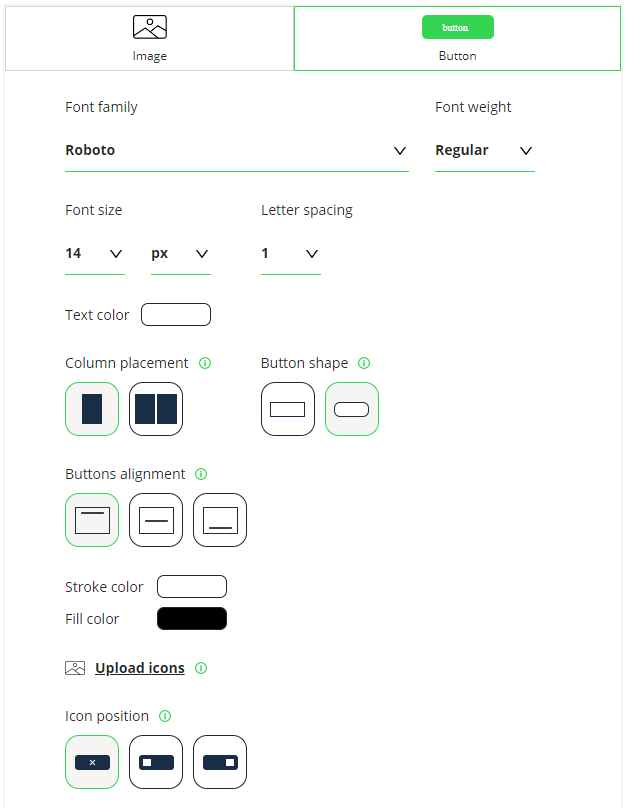
For the Button text, you can select a Font family, Font weight, Font Size and Letter spacing. For more description of the Font definition functions, see this article “Using Font Definition Functions.”
To select a color for your text, click on the colored button in the section to select with the Color Picker.
Column placement – Allows the user to select one or two columns of buttons. Two columns would make sense if you were using icons or shorter button names.
Button shape – Allows the user to select buttons with square or rounded edges.
Button alignment – determines the position in the body of the buttons.
Stroke color – defines the color of the button outline. This can be changed by clicking the button next to stroke color and changing with the Color Picker.
Fill color – defines the color of the button fill. This can be changed by clicking the button next to fill color and changing with the Color Picker.
Icons
You can use icons to identify buttons on your menu. They can be used along or added before or after text on a button.
To make Icons available within this template, the Icons have to be loaded into the template. That is done in this pane with Upload Icons. After clicking, you can add as many icons as necessary to this template that can be used by user creating menus.
Icon position – determines whether icons will be included with the words on a button and can be placed before or after the words on the button.
Footer Component Configuration Pane
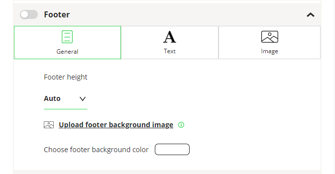
The Footer CCP defines what happens within the bottom section of of your Menu Experience that would be under your buttons. Within this pane, you can define header size and components.
Within the Footer CCP, there are three tabs to maintain different components of the header: General, Text, and Image.
General Tab for Footer
Under the General Tab, you define the size and background for your header.
The Footer height dropdown lets you select the size of the footer: Auto, 20% or 40%.
With Auto, the size of the Footer is determined by the contents, so if you have a lot of text, the footer might be large.
20% and 40% define the percentage of the screen that the footer will take up. This will change based on the size of the device accessing the Menu. The choices here would be based on the look and feel desired by the user. If you are placing an image in the header, a 40% size might make it look better depending on the size of the image.
The Footer background image would be strictly for the footer portion of the Menu and would be used OVER any device background image. The background image is for general look and feel for the menu, while if you were adding a logo, you would probably add that as an Image in the footer and not the background.
To upload an image, click Upload footer background image, and you can upload an image from your local machine or network.
You can also click on the colored button in the section to select a color for the background of the footer in the experience with the Color Picker. This would be the background color for the entire footer.
Text Tab for Footer
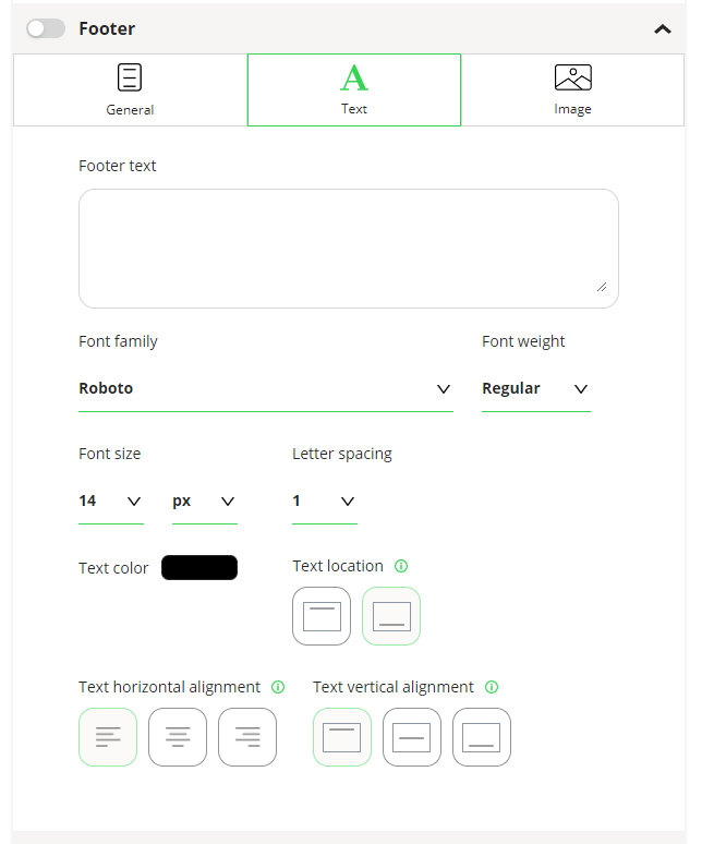
In the text tab, you can enter the text that will appear in the footer as well as specify the look and placement of the text in the footer.
In the Footer text box, you can add any text for the footer. You can add as much text as you want understanding that it can have an effect on the look of the menu.
For the Footer text, you can select a Font family, Font weight, Font Size and Letter spacing. For more description of the Font definition functions, see this article “Using Font Definition Functions.”
To select a color for your text, click on the colored button in the section to select with the Color Picker.
Text location – defines whether any footer text would appear above or below any image that appears in the Footer. If you were planning to have a logo in the Footer with some text below, you would select the button with the bar at the bottom of the square for under the text.
Text horizontal alignment – Defines whether header text would be left justified, centered or right justified.
Text vertical alignment – Defines where the text will appear in the footer: top, middle or bottom. Vertical alignment would define where the text would appear if there were no image. If an image is present in the footer, vertical alignment for the text will be deactivated.
Image Tab for Footer
–
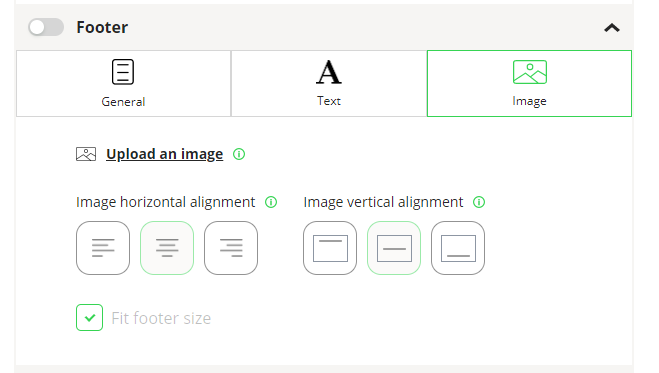
With the Image tab, you can add an image that will be added OVER the footer background.
To upload an image, click Upload an image, and you can upload an image from your local machine or network.
Image Info
Images are adjusted to fit the device accessing the experience, so we recommend SVG or PNG images of at least 250 pixels for best performance. JPG images can be used, but could be distorted with resizing.
Image horizontal alignment – Defines whether the image would be left justified, centered or right justified.
Image vertical alignment – Defines where the text will appear in the header: top, middle or bottom.
Fit Footer Size Checkbox
The checkbox at the bottom of the image panel indicates whether you want your image to be sizes automatically to fit the footer. This allows a user to upload a larger image and have the system resize it to fit.
Although this provides some ease of use in the system, it works the best with .svg and .png images. Resizing with other file types may not offer great results.
An alternative to click to have the image sized automatically is to add an image that is the appropriate size for a mobile device.
Banner Component Configuration Pane
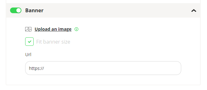
The Banner CCP allows the user to add a banner at the top of the menu that will appear and offer a link to additional information.
It can be used for advertising, announcing new products, promoting discounts, or anything.
To upload an image, click Upload an image, and you can upload an image from your local machine or network.
Image Info
Images will be added at the top of the device and we recommend a size of 350 pixels x 50 pixels.
A Url can be added and when a user clicks on the banner, they will be redirected to the Url added here.
