With the Body Customization, you are configuring the are that comes under the header and above the footer so the Body of your Experience. There are two tabs that cover the Body Customization: Image and Button.
Body Customization – Image Tab
In this section, you are configuring display attributes for an Image that would appear in the body of your Experience.
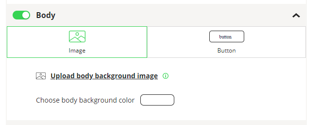
Upload Body Background Image
Clicking on “Upload body background image” will allow you to upload an image from your local machine.
Our recommendation is to upload an image in .png or .svg format (no less than 250 pixels).
The system adapts any image size to the scale of the template. The higher resolution of the picture, the better result of future experience.
Choose Body Background Color
This would allow you to select a background color for the body of your Template. Use the Color Picker to select a color.
Buttons Alignment
You can select where you want the buttons that appear in the body to places in relation to the Body section. Your choices are: Top, Center and Bottom.
Body Customization – Button Tab
In this section you define the look and feel for the Buttons that will appear on a Menu that uses this Template.
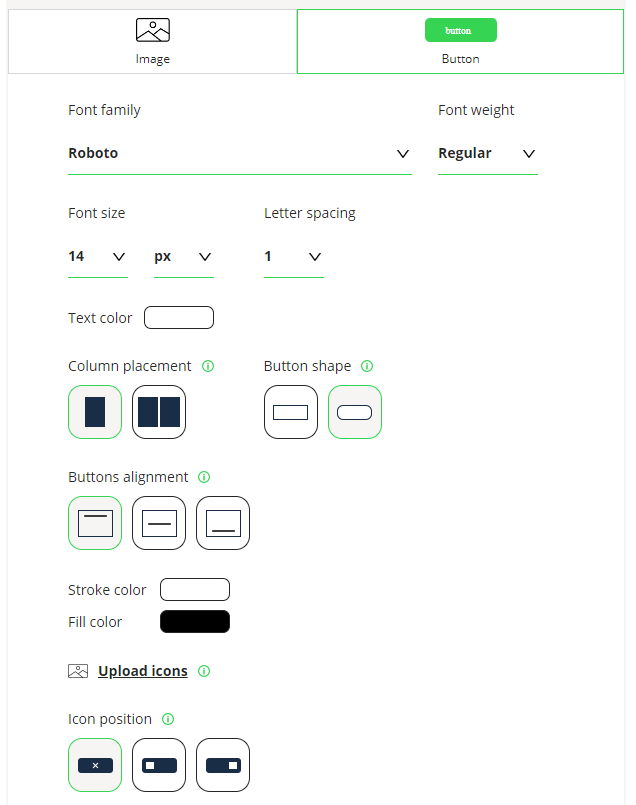
Font Family
The Font Family that will be used for the Button.
Font Weight
You have four choices of Font Weight that will change the look of your font: thin, regular, medium and bold. You will select the type you want from the dropdown.
Font Size
You can choose a number from the left dropdown and then a measurement from the right drop down. Measurements include: PX-pixels, PT-point and others. Changing these values will change the size of the fonts on the Button.
Letter Spacing
This changes the amount of spacing between the letters in the text. The larger the number the more blank space between each letter.
Text Color
Select the Color for any Text in the Header using the Color Picker.
Column Placement
You can choose where to have a single column of buttons or two columns by selecting the Icon for 1 or 2.
Pro Tip – For text buttons a single column of buttons is much more common because of the need for larger buttons with text. For Icons on buttons, two columns can work better to make better use of the space on a screen.
Button Shape
Choose the Icon for rectangle buttons or buttons with a rounded edge.
Stroke Color
Use the Color Picker to select the color of the lines on the Button.
Fill Color
Use the Color Picker to select the color of the Fill of the Button.
Upload Icons
Click “Upload icons” to upload images for the buttons of the Template.
Icon Position
Select the appropriate image to determine where your Icon is places on the Button. Choices are: no icon, before the text, or after the text.
Pro Tip – Use the Preview Screen to test the choices that you make in any configuration steps. Concepts like Font Weight and Font Spacing can be used to change the look and feel of your Buttons and make the Experience more professional. Test different options to get the look you want.